Finished my duvet painting!

I finished my large painting done on a duvet cover to an acceptable level, its still not perfect in my opinion but it’ll do, I have grown quite attached to it however since I’ve spent so long on it, form doing it I have realised that I can’t paint clouds from memory which is a given, obviously, but nevermind. I finally got some images printed off courtesy of Graham so I used them as references for the sky area, I had tried to remember what the sky from another painting looked like and tried to emulate it but it was too linear, and then I came to my senses and realised the reason I like the sky so much is because clouds are generally randomised. I haven’t filled in the grey area along the bottom as I wasn’t sure what to do with it and I think the unfinished look gives it an extra something, but I could just be being lazy but I don’t want to ruin it since I feel it now looks okay.

As for the other photo I painted onto metal, I was intending to experiment on this piece of metal but I didn’t and opted for a sky theme again, I don’t really like it but I figured I’d give metal a go to see what its like, and it was an enjoyable experience and I would like to work on bigger sheets of metal in the future. I reckon the assessment went alright as well but Ill not get my hopes up, today has been a good day.

Smoothy smooth.

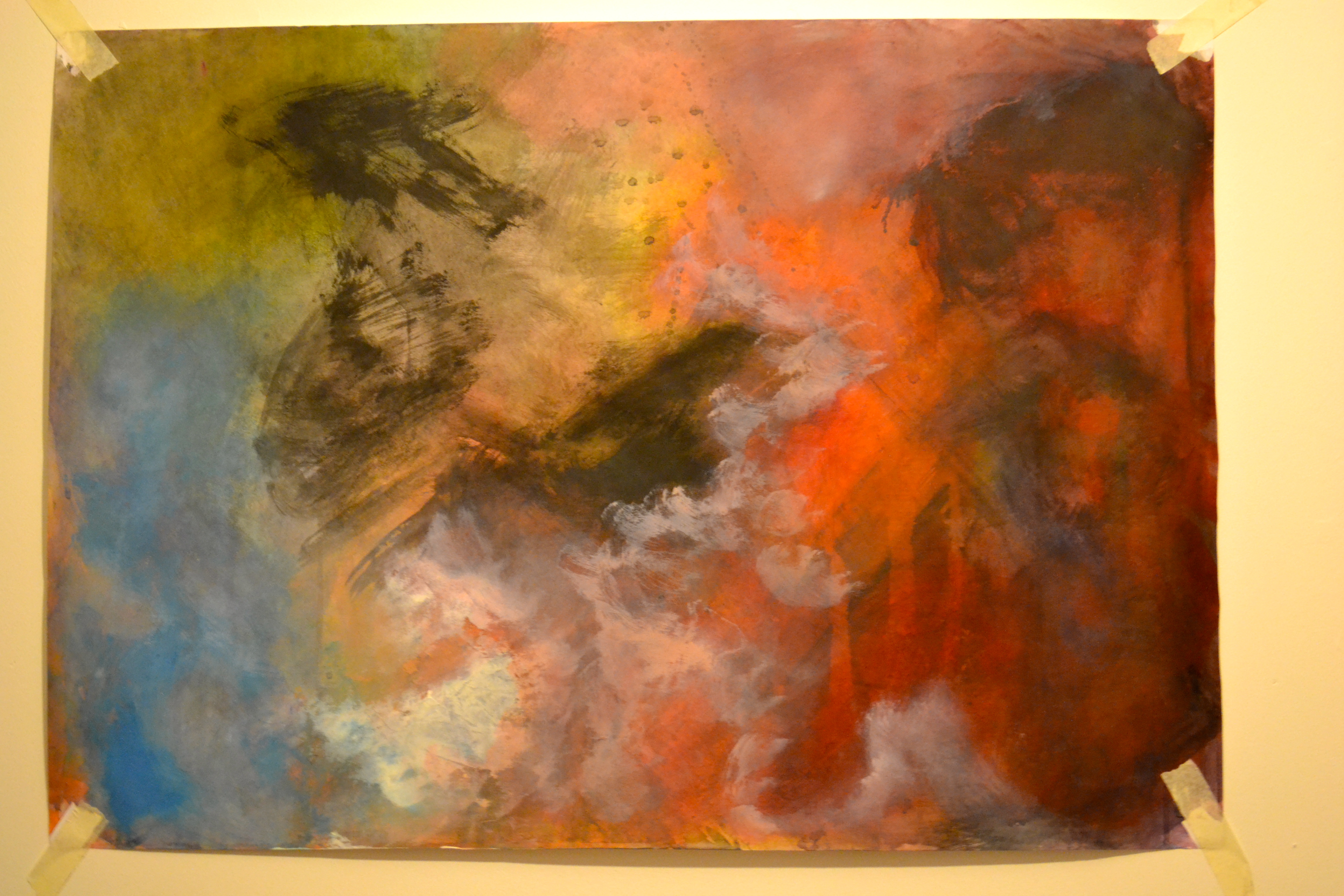
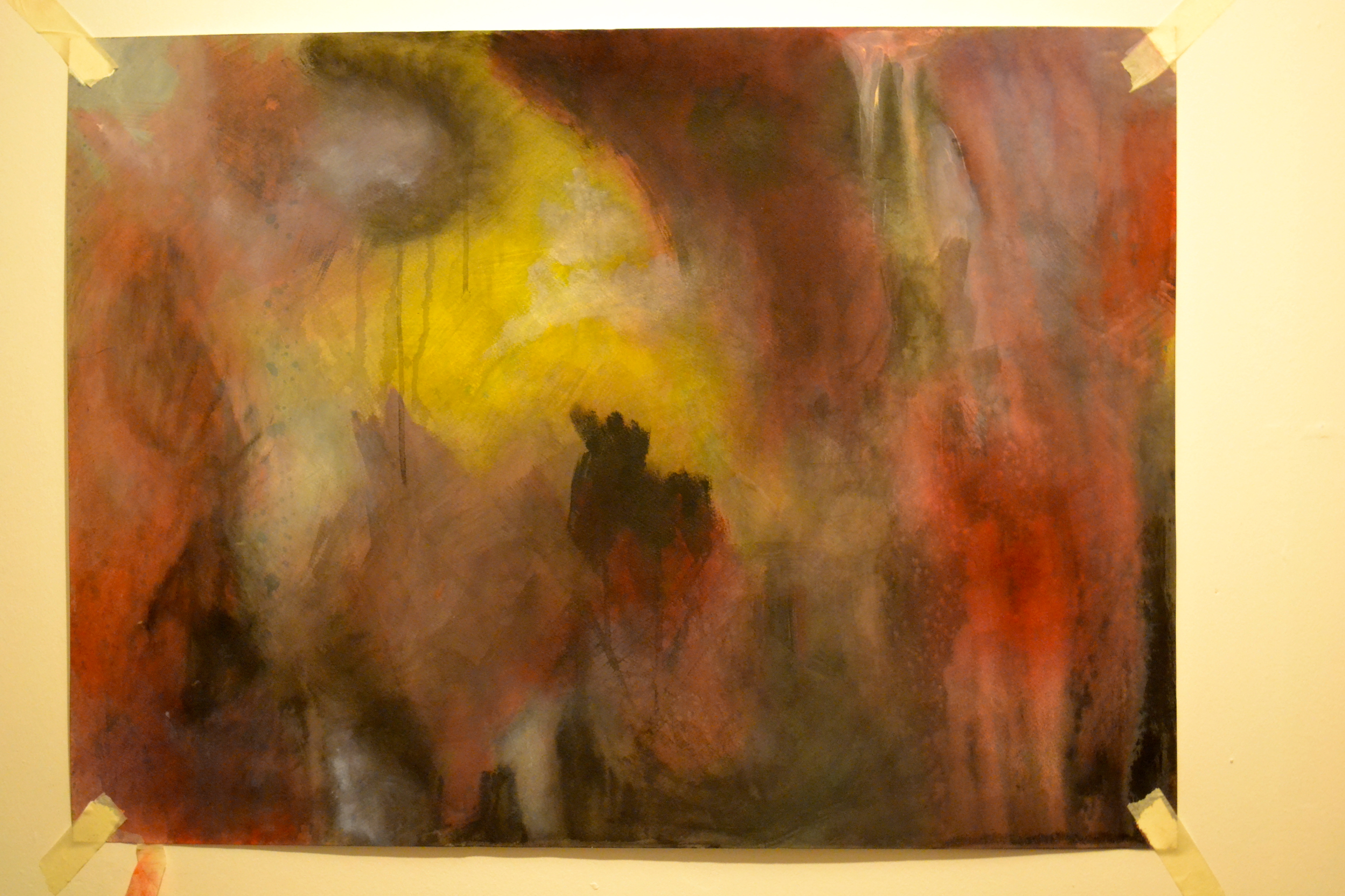
For these two paintings I have been mainly concentrating on how to paint in a more smooth way, instead of using super watered down paint I have been applying it more thickly but not so thick that it is risen from the surface. I really like the way classical paintings look, during our trip to Liverpool I was focusing on how the paintings were being created, and the techniques that the artists used rather than the subject matter. It was refreshing to be able to go close to the paintings and to see the brush marks, and without sounding like I am stating the obvious, it was good to be able to see how trees and foliage were brought to life just by simple brush strokes, when from a distance they look like real life trees. This sounds stupid I know, but when you first see a painting such as Ged Quinn’s ‘The Exiled Forever Coming in to Land’ it is quite intimidating because you see the shapes and forms and wonder how it was painted and you think there is no way you could ever do that. But when you get up close you can see the brush strokes and you can see how the shapes were created and how the highlights are applied, like the clouds are a black shape with strategically placed red areas. But the red areas are just different shades of red and you’ll be able to see the bristle marks if you get close, and I like that. And that is what I have been concentrating on.

But I want to also concentrate more on what my paintings are about, because I often forget and get carried away with actually applying paint to paper or whatever instead. So once I get my bible I am going to read Revelations first, I want to read the whole thing but I figure that if I skip to the section that I want my work to be about then I can be more precise and not get other ideas from other sections etc etc. I have been reading up about apocalypses in different cultures and religions, for example the Mayan Calendar ending on the 21st of December this year, and the end of the world which was supposed to have happened 1 year and 4 days ago according to Harold Camping. Ronald Weinland predicted that Jesus Christ would return on the 27th of May this year and that the world would end on this day

Wikipedia has provided me with a list of dates predicted for apocalyptic events here which is pretty interesting so I am going to look through these and choose events that were supposed to have happened in the last few years, I am particularly interested in Camping’s prediction of the Rapture and earthquakes that were meant to begin on the 21st of May 2011 and end on the 21st October 2011. Even though the bible isn’t exactly a recent publication I still want to read it because obviously these prophecies are based mainly around the coming of Jesus so to me it makes sense to understand exactly what is fuelling these prophecies.

Time to paint!

After a chat with Peter I felt inspired enough to go and collect a duvet cover to stick on my wall to paint on since the workshop has been closed all this time. It was quite rough so I primed it and tried out some acrylic primer but it came in a tiny bottle and it was £9.99 and I ran out reasonably quickly so I invested in some quality matt emulsion from Wilkinsons and primed it with much enthusiasm and it took a week to do because I put on 3 layers of paint and then sanded it down and managed to input a few holes into the fabric, but never mind. It is smooth enough for paint to dribble down and that is what I wanted. I’d also like to work on board again because of its water resistant properties, and I’d like to work on metal or plastic since I am interested in surfaces and how paint works on different surfaces but I do not want to focus entirely on that. I enjoy Keith Tyson’s nature paintings as they are done on metal, and he drips chemicals onto acid primed aluminium which creates patterns and landscapes, I won’t be using acid primed metal but probably just oil paint and turps just to see what happens, however I don’t want to deviate from my initial idea of creating atmospheric paintings but I’d like to try and keep painting ‘intuitively’ since I won’t be able to completely control what happens to the paint if I am dripping turpentine on it but I still want to have a plan or an idea of how to make a painting first rather than just seeing what happens.

Auto-art

I did these paintings before I took the photos from the previous post, and I tried painting in a slightly different way, since this module seems to be about experimentation, so I spent longer on each painting and tried to approach it differently. I began mainly by putting a wash of colour in a ‘random’ shape and let it dry and then added another wash of colour and built it up that way so that some areas were lighter and some darker. For the first couple of paintings I used bright colours which was fun but its not what I really want to do, which is dark moody paintings. So I began the first photo in this post by just using washes of black to begin with, letting them dry and working it up like that until I got light and dark areas then I began adding watered down white paint over the top to see what that did and it was an alright result, and after that I added colour using brusho, which I’ve never used before and I like it. I also tried to use more gestural marks with black straight from the tube sortof how Arnulf Rainer makes marks.

I added those because I think sometimes my paintings look flat even though I have layered up the paint and adding some thicker marks on top adds more dimension. Anyhows, the black/grey painting is my favourite and has turned out rather well and its a technique that I will use for more, bigger paintings by just using one colour and building up from there. I also loaded my brush up with water or watered down paint and splattered it on to give more interest but I am going to try and stay away from that look I think, because it looks generic sometimes.

After I completed the black and white one I realised that I enjoy lights, and the atmosphere lights can give which inspired the photos from the previous post. So I will take more photos of lights and shadows etc and use those as reference points and try to make paintings that are ‘about’ something instead of being entirely ‘intuitive’ and not really about anything. As I say I intend to read the bible because I like the idea of creation and destruction etc and of things larger than us like life and death.

In the beginning, God created fairy lights.

I have been experimenting with lighting in my room since I have fairy lights that glow red and I want to create a dark atmosphere in my paintings so I thought I’d try taking photographs of some stuff to get an idea of how shadows fall and where the light hits on high areas. I also edited some pictures of clouds since I want my paintings to be primarily cloud based so again I figured that they’d be easier to use as a reference if they were in the colours I intend to use, like black, red, blue yellow and white, among others. I have also been looking at John Martin’s oil paintings because I want to make big apocalyptic paintings, and I intend to read the bible because I love the idea of creation and apocalypse and destruction. I don’t want to include figures though, because I still want to keep it vague, in that I mean without people because I think once you add figures then you automatically connect to them, and I like just having colours and whatnot. I’m going to keep painting intuitively but have a bit more direction in my paintings instead of not having an ‘end goal’ ultimately I’d like to try and have more structure this year.